Late out of the gate? Not to worry.
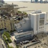
Yes, the Whitney finally got it right. A museum with space designed for being with works of art, with a glorious lightness, so we see the work, not the housing. Only later realize the housing makes it so with its careful use of real light and the soft touch of wide-plank pine floors! I wanted to be barefoot. No clanking heels. No chill up the ankles. No harsh edges either (unless the art proposes them.)

Many museums have flexible wall systems. High ceilings aren’t a surprise. But this one has a flexible boundary between inside and outside, with openings to the outside on every floor. For a half century New York has been altering its relation with the harbor and the docks—now the city’s shoreline no longer needed for the commerce of loading and unloading freight is public space. We’ve had Chelsea Piers, for sure, but the Whitney is the first building designed to employ the new nearness of river water and open sky.
There just are two flaws: First: elevators. Not enough of them. We were visiting on a non-holiday weekday and there were lines in the front lobby for elevator space. Except for the freight elevator, they were all small (if humorously decorated). Too bad.
The second isn’t a true flaw and can be remedied at lower cost than redoing elevators: No Basil King’s! Born in 1935. Working in New York from 1951 to the present. From a teenager steeped in Ab Ex ecstasy to the patient development of his still expanding personal vision.
But otherwise, HUZZAH for the Whitney having broken its long curse…from cramped Victorian 8th Street, to being MOMA’s cheap seats slapped onto its backside, to the brutal stone and cement home on Madison Avenue. Free at last. (Except for the pricey admission.)


